


Standards & Principles
Over the course of the Podium Envision project, we have focused heavily on getting to a viable product for our Development Managers in San Francisco who are working on a masterplan for GDV (Google Development Ventures). During that time, the Product Owner, Product Design team and Engineering teams were working hard to establish a product to the wider LendLease organisation we could all showcase and be proud of. The focus shifted over the course of the last few months to focus less on new features but to bring attention to tightening the over all experience end to end as well as the code being integrated with the other isolated Podium products. The UI Engineering commit and consistency IA structure where possible has now allows us to sharpen our design system and bring focus to working cohesively across the Podium platform with consistent components, pattern libraries and cross collaboration. The maturity of Podium has come a long way and it’s no longer in start up mode but actually a product with buy in from all stakeholders in the organisation.
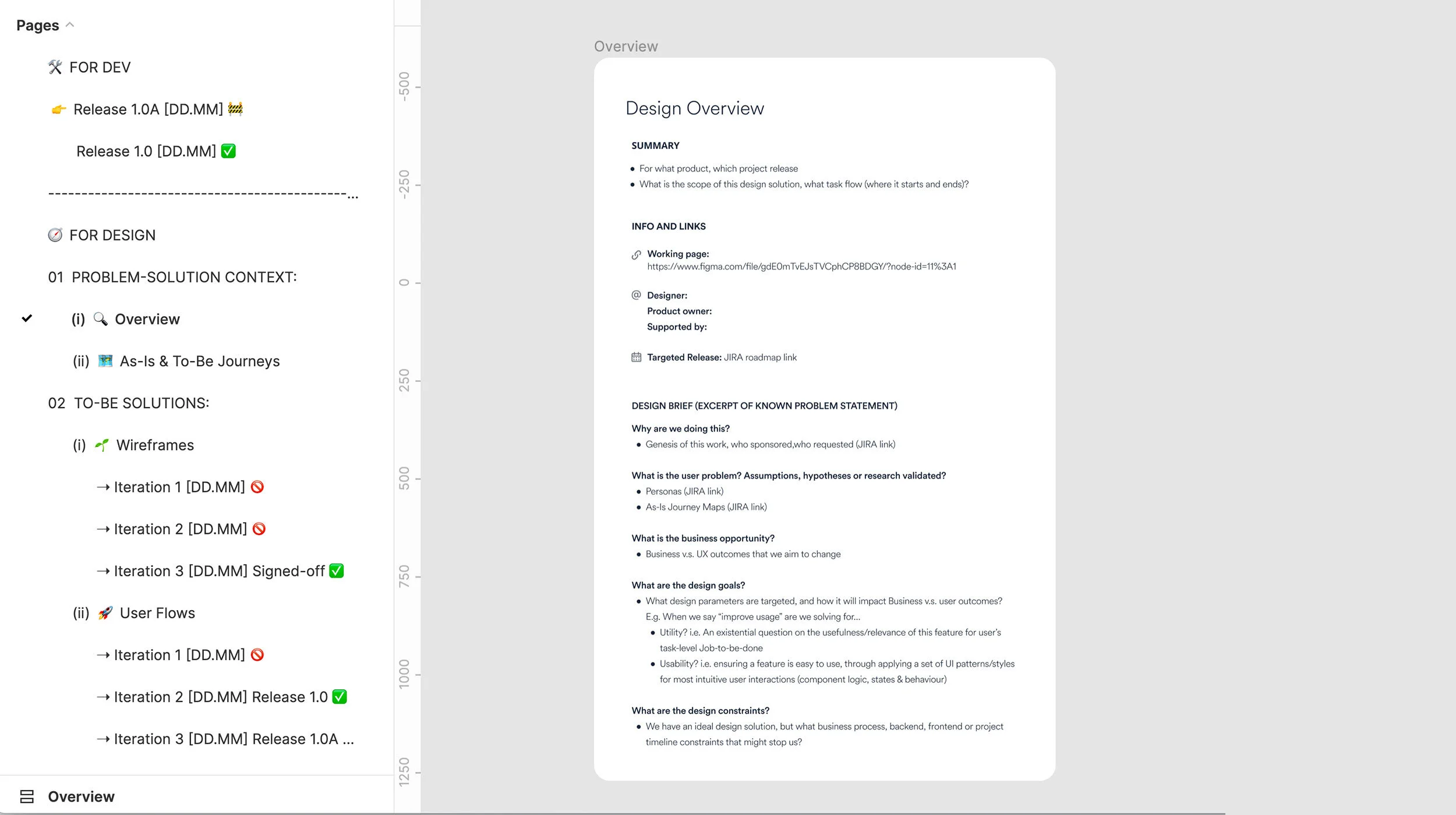
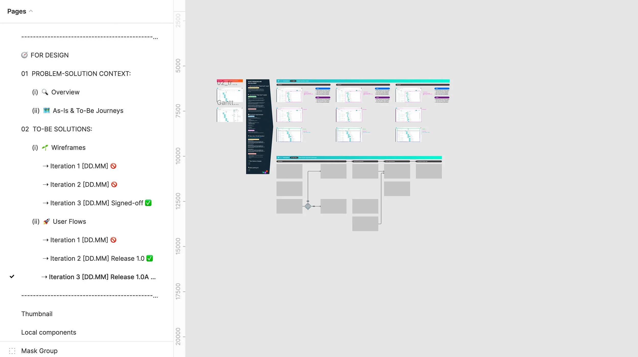
Below are ways in which we started to organise and structure our workspace files and system processes across different design teams. We are now looking to consolidate and have one source of truth across all design teams and engineering teams.
Thumbnails have been created to better organise internal design standards and practices for smoother cross functional streams with all Podium products. Icons for Pattern Libraries and product projects are also created to encourage tidy structure for all teams.
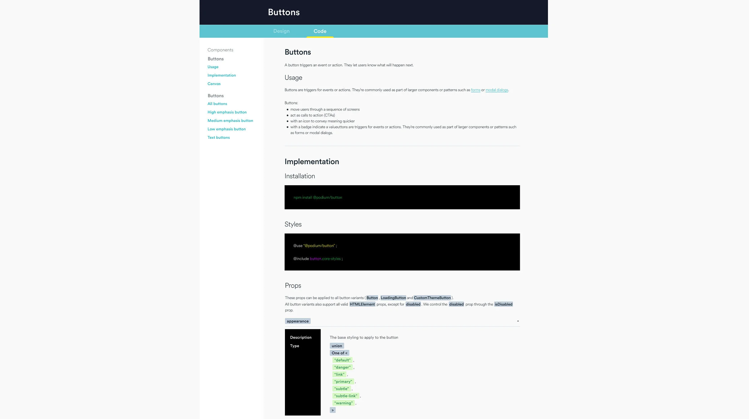
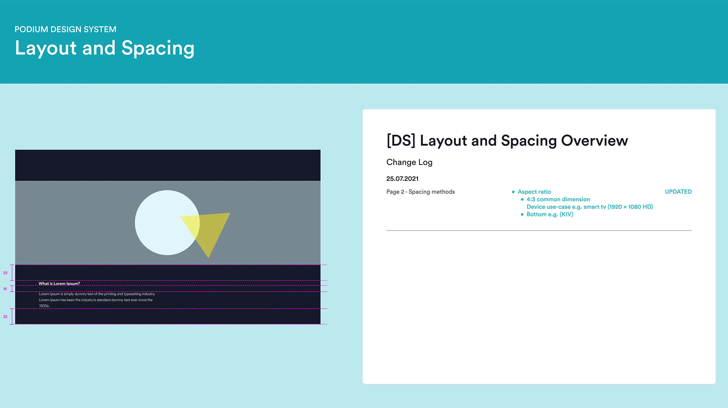
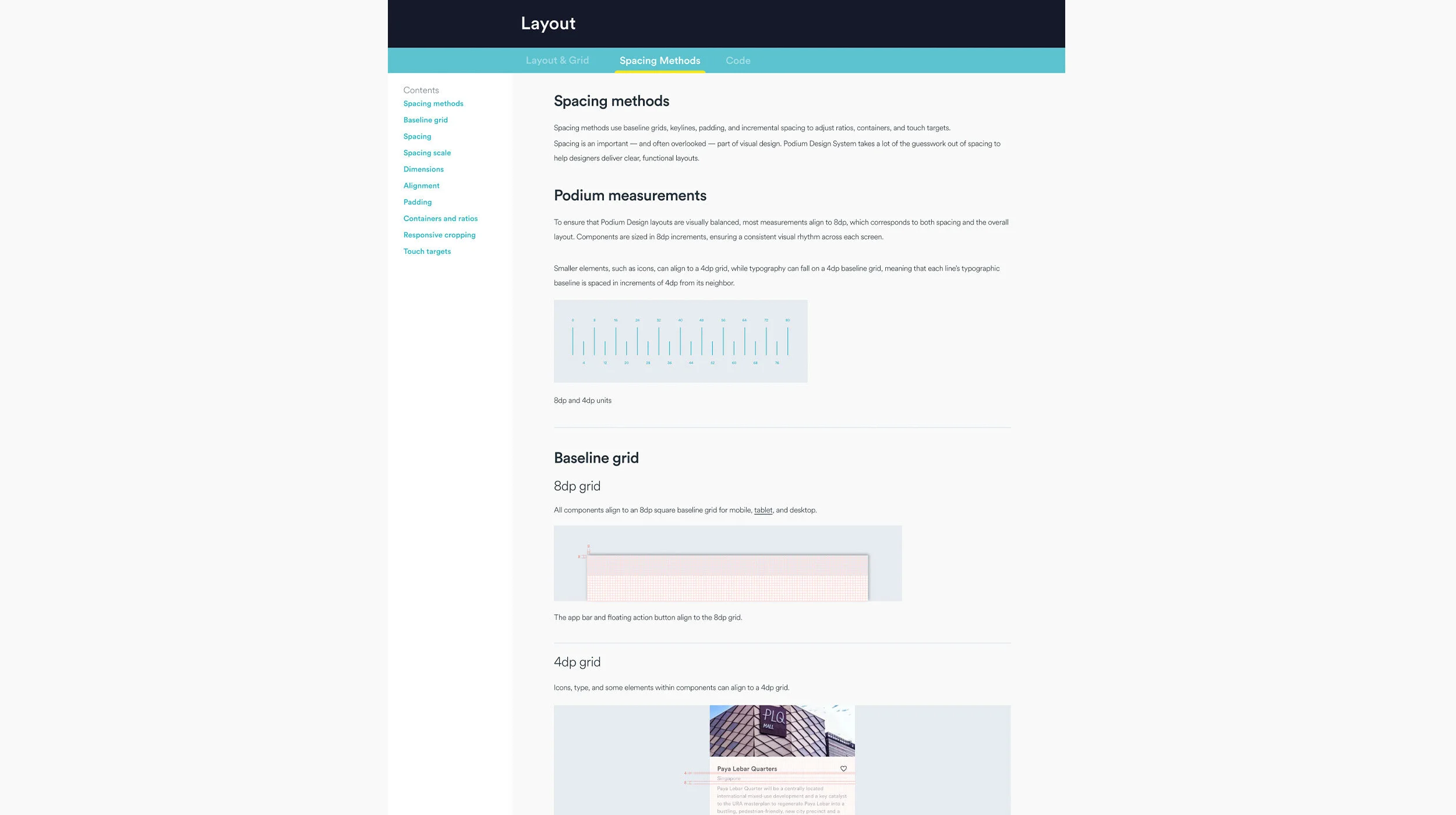
Foundation housing typography and spacing, Atoms have all the individual smaller components such as icons, tooltips, sliders, checkboxes etc. Molecules housing the larger combined component such as navigations, modals, date pickers etc. Organisms which have things like tables, charts, graphs etc. Templates which have layout, spacing, margins, grids etc.